Inclusive Exhibition Labels & Signage for Accessible Museums & Galleries
![]()
“Exhibitions are complex presentations that convey concepts, showcase objects, and excite the senses. However, as museums recognise the diversity within their audiences, they realise that exhibitions must do more: exhibitions must teach to different learning styles, respond to issues of cultural and gender equity, and offer multiple levels of information.”
Smithsonian Guidelines for Accessible Exhibition Design
The Disability Discrimination Act, passed in 1995 and later replaced in England, Scotland, and Wales by the 2010 Equality Act, was a pioneering edict designed to protect those with disabilities from discrimination in employment, the provision of goods and services, education and transport.
As a result of the act, museums and galleries, as important public service providers, were required to take reasonable steps to ensure their exhibitions and displays were sufficiently accessible to disabled individuals.
Helpfully, with the right information and signage products, planning and execution in the early stages of a project, accessible design in museums and art galleries doesn’t need to be complex or even expensive.
Indeed, inclusive or universal design can be applied to these spaces with a few simple considerations; ideas that museum and gallery owners should adopt to create a welcoming environment for all visitors to enjoy art and culture without the fear of feeling marginalised.
In today’s blog, we’re looking at 5 different ways you can improve the accessibility of your museum and art gallery facility through exhibition labels and signage.
Summary
Below we expand on the following areas involved in creating accessible art galleries and museums with inclusive exhibition labels and signage:- Simplifying exhibition language for all visitors
- Enhancing readability in exhibition texts
- Optimising label design and typeface for accessibility
- Maximising contrast for better legibility
- Reducing glare and optimising label placement for accessibility
1. Simplifying exhibition language for all visitors
To ensure that essential information on exhibition labels is accessible to everyone, including those with reading difficulties, it's important to prioritise clarity and simplicity when labelling artwork or museum exhibitions. With this in mind, using straightforward, plain language should always be the underlying goal; avoiding colloquialisms, jargon, or technical language unless absolutely necessary.If specialised terms must be used, they should be clearly explained within the text itself to accommodate all visitors, including for those reading in their second language, or those with cognitive or learning difficulties. As much as providing information to visitors, art gallery and museum labels are there to provide narrative and background, and this simplified approach helps convey that story without linguistic barriers and enhance the visitor experience.
2. Enhancing readability in exhibition texts
The number one goal of accessible signage and labelling is clear and effective communication. When constructing your labels for art or museum displays, it’s recommended to use the active voice and maintain a straightforward subject-verb-object structure to improve clarity and understanding.Keep sentences short, text width narrow if possible, and start each panel with a concise overview to help provide context. Take care to link sentences and paragraphs logically, avoiding distant pronouns and limiting each to a single idea. Incorporating visual aids like line drawings and photographs can also help significantly with comprehension.
3. Optimising label design and typeface for accessibility
Effective label design is crucial for making exhibition information accessible to all visitors, including those who struggle to read print. A good place to start is adopting clear and legible typefaces for your labels, preferably sans serif or simple serif, with clean, easy-to-distinguish letterforms and proportions. Avoid condensed, extended, or light typefaces — and limit the amount of capitalisation used in body text, which can be challenging to read.Instead, use alternatives like underlining or boldface for emphasis. Meanwhile, providing information in alternative formats like Braille or audio within your gallery or museum is an excellent way of creating a more accommodating space for your visitors.
4. Maximising contrast for better legibility
From a design point-of-view, high contrast between text and background significantly enhances legibility, especially for people with vision impairment. Dark text on a light background generally offers better readability than light text on dark — particularly for headlines. Light on dark, however, can be effective for back-lit labels if the light intensity is carefully controlled to prevent a halo effect.When using reversed type, be sure to increase the letter spacing and choose a lighter type weight to maintain clarity. Avoid overprinting text on patterned or textured backgrounds as it reduces legibility, and choose solid backgrounds for printed materials to ensure the text stands out clearly.
5. Reducing glare and optimising label placement for accessibility
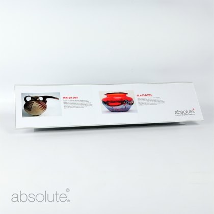
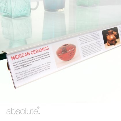
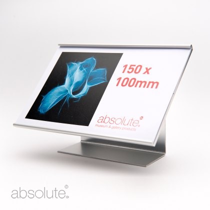
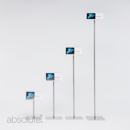
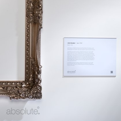
Minimising glare is essential for making text legible, especially for individuals with poor vision. Labels should be printed on non-glare surfaces such as matte — we’d also recommend using aluminium-backed label holders with a low-reflect acrylic front. Compared to plexiglass, this design reduces glare, reflections, and other visual disturbances while offering robust protection against shattering, abrasions, and static.Ensure information stands and label holders are positioned at accessible heights and angles, allowing all visitors, including those with mobility aids or wheelchairs, or those who need to be close, to read them easily without obstruction. Proper lighting is also key to preventing shadows that decrease readability.
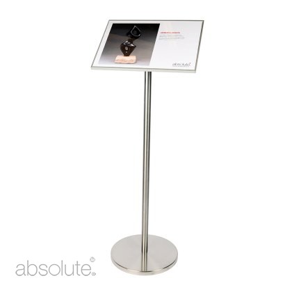
When using information stands, we recommend an angle of thirty degrees from the vertical which improves accessibility for wheelchair users and younger audience members whilst being easily readable for adults and helps diminish any potential for reflected glare from overhead lighting.
Art is for Everyone
The very best art galleries or museums won’t create accessible and inclusive environments for their visitors because of a mandatory piece of legislation — they’ll do it out of a passion for engaging and educating a diverse audience.Art is for everyone, as the old Keith Haring quote goes, and by adopting these simple practices, you can make sure your display labels and signage are able to truly communicate and connect with your visitors. If you’d like any advice or guidance on the right information and signage products for your gallery, please do get in touch.
How can we help?
Get in Touch
Speak with an experienced member of our team today to get best practice advice on improving the accessibility of your exhibition labelling and signage.Labelling & Signage Products
Display Case Label Holderfrom $105.84 (ex VAT)Information Stand (US)from $388.08 (ex VAT)Shelf Edge Label Holder$149.94 (ex VAT)Freestanding Label Holderfrom $41.16 (ex VAT)Pinnacle Label Holderfrom $133.77 (ex VAT)Label Holderfrom $13.97 (ex VAT)-
Posted by Jade Turner
10th May 2024


